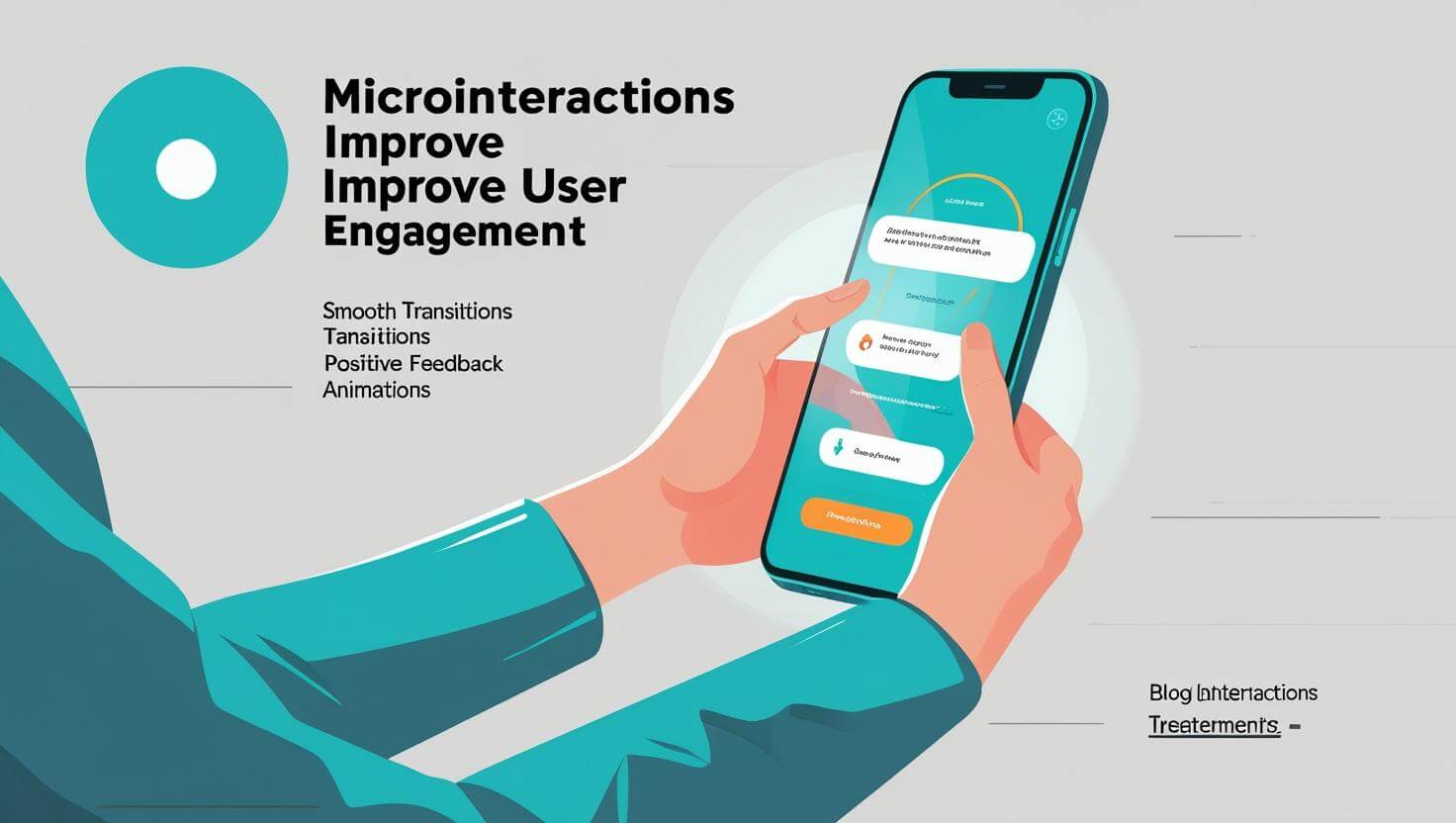
Ever noticed how a button changes color when you hover over it, or a tiny animation appears when you send a message? Those little details are called microinteractions, and while they might seem small, they make a big difference in how users experience your website or app.
What Are Microinteractions?
Microinteractions are small, purposeful design elements that guide users, confirm their actions, and add personality to an interface. Examples include:
A progress bar showing file upload status
A heart icon filling in when you “like” a post
A shake animation when you enter the wrong password
Why They Matter
Make the Interface Feel Alive: Microinteractions add feedback that makes digital experiences more human.
Guide Users Without Words: Instead of long instructions, animations subtly show users what’s happening.
Increase Engagement: People are more likely to interact with elements that respond visually to their actions.
Best Practices for Microinteractions
Keep Them Subtle – They should enhance, not distract.
Match Your Brand Personality – Playful, professional, or minimal—microinteractions should feel consistent.
Ensure Accessibility – Animations should be optional or mild enough for sensitive users.